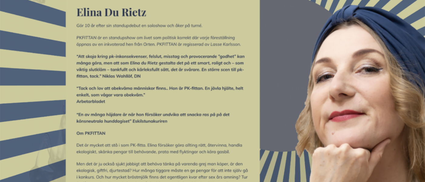
With an extremely small budget and a big vision, I got the opportunity to do all the design for the show pkfittan. Since the resources were small, it was important to think smart and frugal in order to get as much value out of the time that was available. The result was a design that depicts the intention of the show with the possibility to use it in both printed and digital format.
Brief
The background information I was given was to make a design that was pc (Politically Correct) and based on the following hashtags:
#feminism #recycling #metoo #EUmigrants #sistabriefen #flykting #knytblus #ekologiskmat #vegetarian # environmentally friendly #vegan #källsortering #reuse #waldorf #cykel #elbil #hornstull #södermalm #secondhand
Method
I worked in short iterations and started with the graphic ideas to find supporting design elements. I kept a strict time-boxes and really opted for quantity in the beginning. Trying not to censor myself when coming up with ideas. For me that meant working with sketches on paper. Trying out different takes of expressions on the theme with the hashtags as my backdrop. Each iteration ended with feedback from colleagues and the client. Especially the feedback from my colleagues was very helpful in keeping the stakes low. All the feedback was given over a fika where they participated voluntarily. This meant that I could keep the budget at a minimum and at the same time get really good insights from skilled professionals without having to eat up the budget.
Since there was constraints in both budget and time I opted for the choice of a one-pager website where all information was easily accessible to the visitor. The advantages was that I saved time and also could use a lot of best practices in creating landing pages and not re-inventing the wheel. Instead I let the colors, and hero image of the project be the main pillars for the website.
Since i worked on my own on the project I went for prototyping on paper and discussed them directly with the client and resting them on potential visitors. The latter was small groups of people the the client had gathered and some of my colleagues to get a view of best practices. The sketches were then translated into a WordPress theme after approval for swift implementation and getting the site up an running as soon as possible.
Results
The performance had a good impact in the media and the site was used as a hub for the entire tour that followed the premiere in Stockholm.
The design elements was used in posters, business cards, parts of the scenography and not least in the web design, which created a cohesive experience for the visitor right from the start.
